ROME Conferences
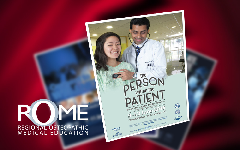
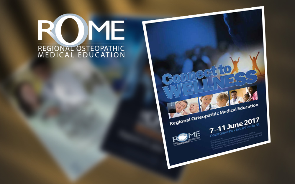
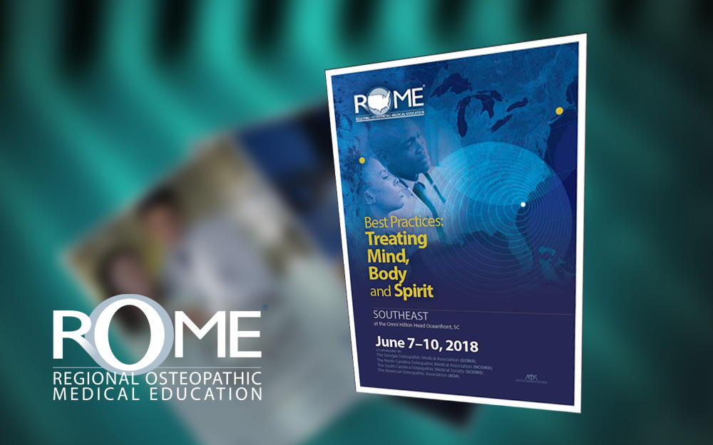
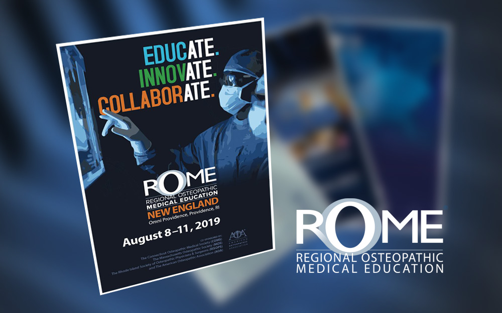
For four years beginning in 2016, I developed the marketing images and branding for the annual ROME (Regional Osteopathic Medical Education) series of CME conferences. The save-the-date postcard mailers are shown here. For 2016, we featured a photorealistic composite of three images – the doctor-patient pair; an alternate take of the patient’s face; and the hospital background setting – along with a custom headline treatment. The following year, we went with a more interpretive/expressive style of composite. The 2018 marketing approach differed slightly in that I conceived it as a set of three unique variations on a unified design – one for each of the three conferences that make up the series. For 2019, I revised and simplified the logo.

